plotly包是一个可以直接绘制可交互图表的R包。
下面使用ggplot2中的diamonds数据做演示。
library(plotly)
library(dplyr)
library(magrittr)

data(diamonds, package = "ggplot2")
plot_ly()
我们只需要将变量的名字映射给可视化的参数,plot_ly()可以自动尝试寻找合适个图形来展示数据。
# plotly tries to find a sensible geometrix
plotly::plot_ly(diamonds, x = ~cut)
plotly::plot_ly(diamonds, x = ~cut, y = ~clarity)
plotly::plot_ly(diamonds, x = ~cut,
                color = ~clarity,
                colors = "Accent")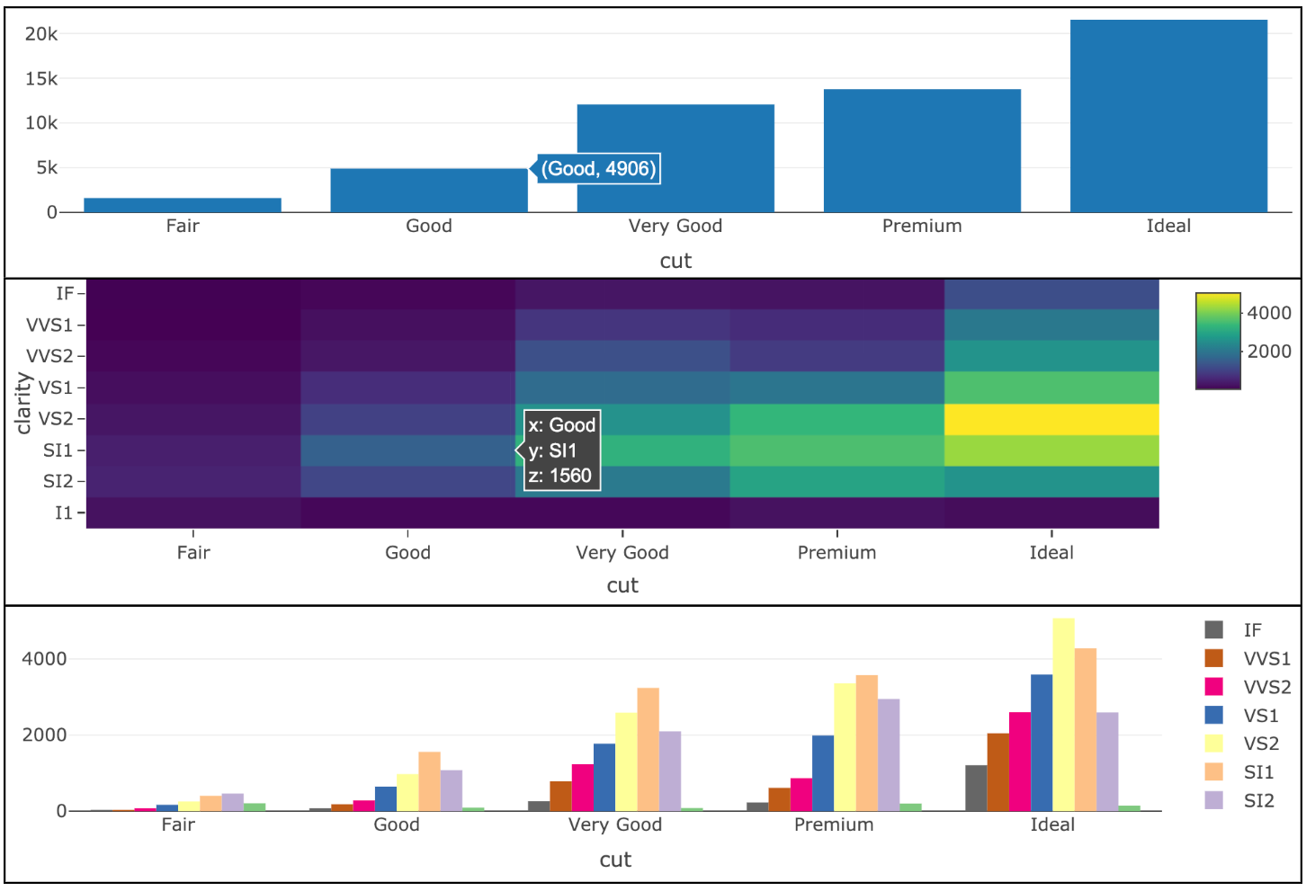
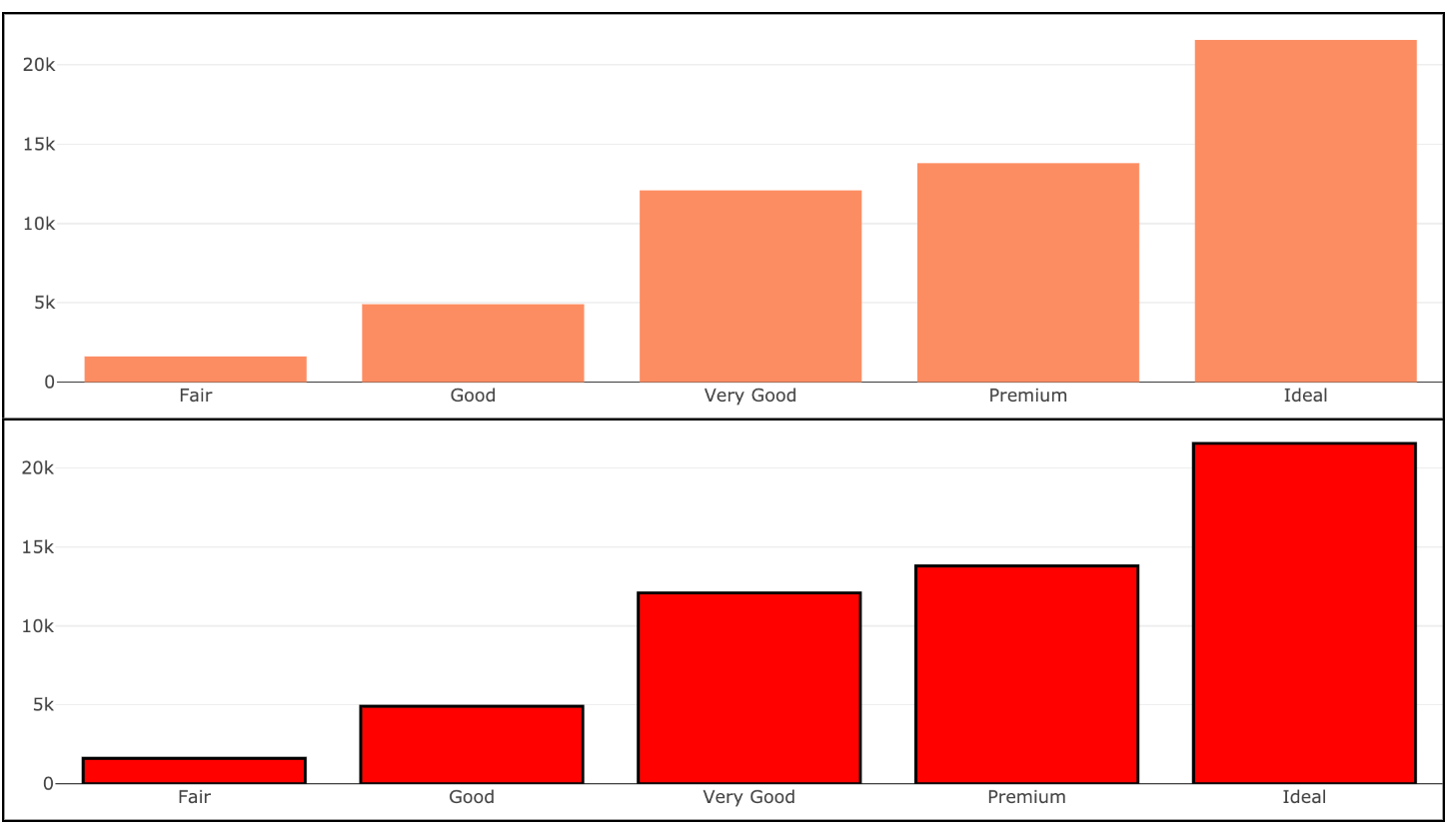
plot_ly有大量的参数可以方便的调整你的图表,但是与ggplot2不同的是,如果你直接定义可视范围(如下图一),并不会得到你想要的结果,这里需要使用I(),声明该值位Asls。结果如下图二。
# doesn't produce black bars
plotly::plot_ly(diamonds, x = ~cut, color = "black")
# produces red bars with black outline
plotly::plot_ly(
  diamonds,
  x = ~cut,
  color = I("red"),
  stroke = I("black"),
  span = I(2)
)
layout
plotly包使用了纯粹的分层图形语法,大量的函数都将plotly对象作为第一个参数。接下来使用一个layout例子来演示。
# modify
plotly::layout(
  plot_ly(diamonds, x = ~cut),
  title = "My beatiful histogram"
)
管道操作
然而这样的表现形式随着图形复杂度的上升,会显得十分臃肿。随意plotly包同样支持管道操作。
diamonds %>%
  plotly::plot_ly(x = ~cut) %>%
plotly::layout(title = "My beatiful histogram")除了layout之外,还有add_*族的一系列函数可以将数据渲染为几何对象。比如:
# use add_* functions
diamonds %>%
  plotly::plot_ly() %>%
plotly::add_histogram(x = ~cut)还可以和dplyr连用进行一些更加复杂的数据操作。
diamonds %>%
plotly::plot_ly(x = ~cut) %>%
plotly::add_histogram() %>%
group_by(cut) %>%
summarise(n = n()) %>%
plotly::add_text(
text = ~scales::comma(n), # 定义内容
# scales::comma 强制使用十进制显示数字,并三位添加一个逗号
y = ~n, # 定义文字坐标轴位置
textposition = "top middle",
cliponaxis = FALSE
)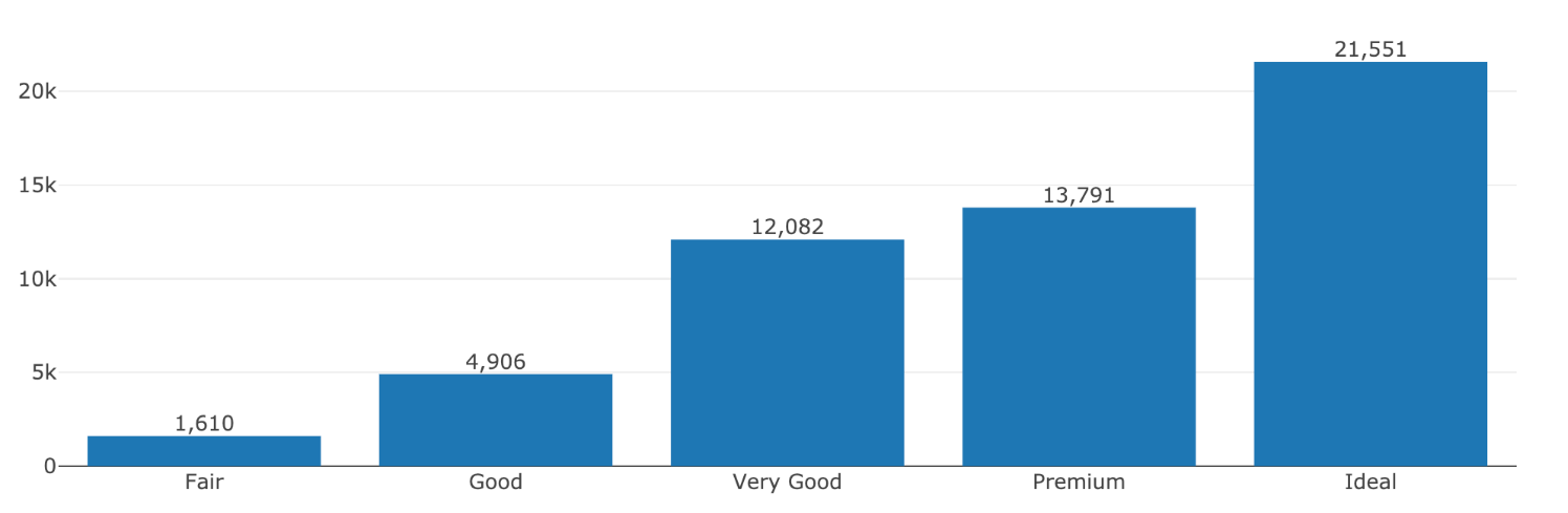 在处理数据和绘图的过程中,可以随时使用
plotly_data来检查你的数据,以便于debug。
diamonds %>%
  plotly::plot_ly(x = ~cut) %>%
  plotly::add_histogram() %>%
  group_by(cut) %>%
  summarise(n = n()) %>%
  plotly::plotly_data()
## # A tibble: 5 x 2
## cut n
## <ord> <int>
## 1 Fair 1610
## 2 Good 4906
## 3 Very Good 12082
## 4 Premium 13791
## 5 Ideal 21551